You will not complain about how cold you are during winter after reading this.
In Jon Krakauer’s second book, Into Thin Air, Jon elucidates upon a previously written article for Outside, a magazine. He writes about his ascent to the top of the world, Mount Everest. His preceding book, Into The Wild, was already a hit, spending two years on the New York Times best seller list and it was made into a movie in 2007. However, this was not even close to surmounting Into Thin Air, which hit number one on The New York Times non-fiction bestseller list, was honored as ‘Book of the Year’ by Time, and was one of the three finalists considered for the General Non-Fiction Pulitzer Prize in 1998. This personal account of his Mount Everest disaster keeps you on the edge of the mountain and away from the protection of a tent.
The fact that Krakauer is a reporter is evident from his writing style, he includes third party quotes, quotes from climbers present, historical information, his opinions, and information from interviews with other climbers. This puts on the crampons you need to navigate the icy context of the climb, past and present. In addition Krakauer tries to pin point every point in time; each chapter begins with a location, date and height. Even the fact that he begins with telling us that six people will die is reflective of his reporter style of writing, a hook.
As far as hooks go, this whole book is a hook, one whose pages fix the ropes that guide you up the mountain. There is barely a moment to become sidetracked because bad luck is the standard, even as they are climbing up. Fortunately for the reader, Krakauer sets up 21 well placed “camps” where the reader can take a breather and take in the preceding chapter while an illustration provides a setting for the next chapter. Even without these illustrations, everything is described well and is embellished to a point where envisioning people, places and hardships are easy, yet they do not take away from the story.
After all of this, the reader will know why the book deserves and received the merits it did. Krakauer’s reporter like writing style really works and is not only interesting, but actually arouses feeling, wether that be of adventure, excitement, or most importantly, morbid despair.
So next time you want to complain about how your hands are cold in 30 degree weather, imagine -40 degrees without gloves and having to climb down a mountain.
Monday, December 5, 2011
Birdy Nam Nam

DJs making music and spinning it is one thing, but DJs making music by spinning is another level.
To ice the cake, not only is there one DJ making music by spinning but four DJs consecutively spinning to make music. Birdy Nam Nam is a group of four French DJs, each with their own turn table and unique record, who play together and make music by combining beats and sounds. To put it simply, they make original music with unoriginal content, thus earning them much acclaim and awards, including the DMC Technics 2002 World TEAM Championships. Beat that Girl Talk.
Birdy Nam Nam’s goal?
“To use the turntable player as an actual musical instrument” and they sure do it well. With such an original concept, nothing sounds quiet like it. Literally nothing. It definitely resembles electronic dance music because it utilizes artificially created sounds, but the use of drums, violins, guitars, vocals and other traditional sounds distorts this classification. Another attribute that distorts Birdy Nam Nam’s classification is the fact that each song has a different set of samples used, so each track is unique (other than Violons part 2).
One may say, “Oh, so they are DJs. This means that there is a whole bunch of scratches and squeaks.”
The most amazing characteristic of Birdy Nam Nam’s music is the fact that there are barely any clearly heard scratches or squeaks. This goes against what most DJs music is known for. Sure one might find a few stray scratches, but overall the group fades in and out extremely efficiently. Either that or the scratches blend in and sound natural.
Birdy Nam Nam’s unique sound and method are really something worth checking out. With its four DJs working together to create original music, This group is truly bringing something new to the turntable.
Amuse 126

Running water. Noxious fumes. Vortexes. The dripping of blood. Vestigial parts eroding. These appear to be taken from a science magazine but they are not. These are the images that come to mind when looking at one of AMUSE 126’s newer pieces. It is featured in an undisclosed building’s interior wall. This location tells a story of neglect, as the walls have holes and the hardwood floors are blackened, making the clean artwork look out of place.
Once one lays his eyes on Amuse’s piece he will swear it was moving. Flowing black and brown lines that extend from the negative space between the M and the S look like noxious fumes lingering through the air. Free floating and undulating black lines that thicken as they retreat from the main focal point add to the lingering air effect. Disconnected lines from the bottom of the A, in partnership with white lines cutting into the A, gives the viewer an impression of a cracking and crumbling sandstone rock. Keen white lines cut into and exit out of the S. They resemble a bear’s claw that slashed into the meat of the letter. Accent lines permeating from the top of the letter S gives the viewer a sense that the S is collapsing in on itself; especially since the letter’s width is spacious on top but suddenly thins at the curve. This fading contrasts with the rest of the letters, whose tops are sharp and defined. Multiple shades of blue and white stream throughout the whole piece. They end as Aqua blue lines that ribbon around the leg of the R only to be pressurized and gushed out of the end in thin streams. All of this is only the half of it. Everything is topped off by blood red dripping from multiple points, which gives a final impression that the letters are in pain, as if they where calm and at rest before an artist came and ransacked them. Even the tags on either side seemed to be attacked.
Normally an artist attempts to create his art in a way that will lure it’s viewer closer. Instead this piece has a menacing look, one that makes the viewer feel like he will be sucked into the chaos if they come too close.These are the robust images of AMUSE 126’s new piece. One whose location will never be advertised nor filled with well dressed people sipping on wine but will be left in that deteriorating building, only to be viewed by a few people who accidentally stumble upon it while exploring the nooks and crannies of Chicago.
Monday, November 28, 2011

When most people think of art, they picture Picasso, Da Vinci, Munch and other classic artists, the images that come to mind are of paintings, sculptures, photography and mosaics. Juxtapoz.com, an extension of Juxtapoz Magazine, attempts to push our conceptions of art into a new age by trying to alter the more subjective of arts (and their mediums) into something that is a little more accepted. All arts are subjective but some seem more then others. In addition to the arts, Juxtapoz contains other culturally up-to-date sections. Fortunately for the viewer, this array of content is presented in a visually appealing and organized fashion.
Juxtapoz is an arts and cultural magazine and its website echos that image. The site is not your typical NewYorker nor theartnewspaper.com, which typically dwells on more classical ideas of art. Instead, Juxtapoz.com focuses on the most tortured of artists, some of whom that are completely shunned by the preponderance of society and others whom do not receive as much insignia as they should. These artist are often overlooked and dismissed by the majority of people because of their medium, canvas, tools or even concepts.
These arts include Illustration, Erotica, Street Art, Graffiti and Tattoo Art.
The best part about Juxtapoz.com is its streamlined navigation with an interface so easy to use that even an Apple user could comprehend. This is quiet the marvel because a majority of websites that present information feel cluttered, with movement between content being more of a tedious search and destroy mission rather then an enjoyable experience. Or as Apple users call it, a PC. The wed-site does this with a simple tool that all sites utilize, a link menu, but unlike other sites, Juxtapoz has a layout that compliments it. Articles and features are displayed in a top to bottom, consistent, linear fashion that is uninterrupted and whose allotted space is carbon copied. Each displays a title, photo and short description so distinguishing between what interests you and what does not is simple. If there is something other then an article on the page, it is clearly separated or incased by a light grey boarder that is never obscured. Search bars, advertisements and social media connections are placed properly, easily understood, function properly and are up to date with todays internet culture. This creates an inviting setting that keeps one interested and on the website for hours. This modern layout and modern features reflect the culture it presents.
Unfortunately the cultural aspects of Juxtapoz.com appear to have been an after thought. Gallery and event posting are hard to explore and have no way to distinguish events in specific areas. What is done instead is a clumping of every event into a calendar. On top of this, animated gifs, which is usually a comical moving picture, are shoved into a corner and advertisements do not appear to relate to the viewer base. Finally, the Violent Uprising tab needs a name change as it does not describe its content well, albeit it offers great content.
The only well thought out culture related section is one on the 99 percent movement and other turmoils around the world. The 99 percent coverage is exceptional because offers a different perspective on the protests, one that is not biased toward the institutions against them (of course media giants will spin the protests negatively people!). All these unconventional topics tie-in well and in an interesting fashion. However as mentioned earlier, the tab needs a name change to better reflect the section.
Overall Juxtapoz has an enthralling array of unorthodox material with a layout that compliments it, thus making everything easy to access and share with others. Furthermore, Juxtapoz.com provides quality free material that will most likely invoke interest in purchasing a subscription. The site’s cultural content needs work but otherwise touches on unique subjects and interesting events. In the end, looking at this site will most likely have one’s perceptions on art obscured or redefined. Maybe in the future artists like Bansky, Amuse 147, Lango, Jeremy Clark or others could hold the same prestige as we hold artists like Van Gogh.
Monday, November 21, 2011
Mad Men
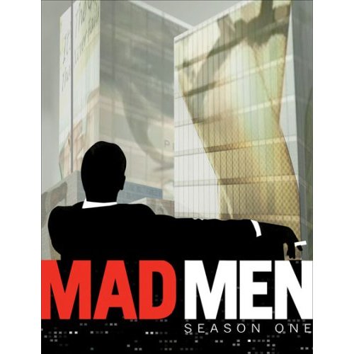
Man Men, the show, takes the viewer to another time in America. An America whose values seem to be a worlds away. This precise aspect is what transforms the production into a mildly compelling show. Even though the time setting was 50 years ago, the concepts appear so alien.
Creator Matthew Weiner, who helped write the last 3 seasons of The Sopranos and was a staff writer for Becker, is now writing about the field of marketing as it was in the 1950’s. Figures representing the practical, illustrative and research of advertising are present in the forms of Don Draper (played by Jon Hamm), Salvatore Romano (played by Bryan Batt) and Dr. Gretta Guttman (played by Gordana Rashovich), respectively. Evidently, research is the unwanted step-child of the three.
Throughout the whole pilot, every scene contained someone smoking a cigarette, if not everyone. This reflects the nature of 1950’s attitude toward tobacco use and it is quite eye opening. Restaurants, bars, houses, offices, elevators and even doctors’ offices, there is no place where smoking is not allowed. The ubiquitous nature of smoking in the 1950‘s is so bizarre to our time. A time where smoking is banned at indoor public spaces; even though these laws was only applied recently.
“Old Gold man, huh?... Can I ask you a question? Why do you smoke Old Golds?”
Don Draper is the creative director at Sterling Cooper and is having trouble coming up with a new position for big time tobacco company, Lucky Strike. This is largely due to the revelation that cigarettes cause cancer. With cigarette company’s inability to make health claims and them having to deal with an aggravated public opinion, Draper is stumped. His frustration is exacerbated by another client that he must meet with before confronting the tobacco giant. With such a big client, big money is at risk.
“Gentlemen I really thought you could do better then this. Sterling Cooper has a reputation for being innovative.”
Already stressed, Don Draper must meet with Rachel Menken, who is representing Menken’s department store. Played by Magggie Siff, she plays the “going against the odds and norms” character that is trying to revive her plummeting company. She is adverse to the ideas that are being pitched at her by Draper. A combination of previous stress, expectations towards women and Ms. Menken’s sassy attitude clouds Draper’s judgment and he blunders, causing the loss of a potential high paying customer. All because Draper will not treat her as an equal.
“Oh, I’m sorry I was expecting...” “you were expecting me to be a man? my father was too.”
Rachel Menken is already aware of the disadvantages that women face in the 1950s. Mad Men really exposes gender roles, expectations and disadvantages of the time period. As with Ms. Menken, Women are not taken seriously nor as equals; women are expected to be wives and secretaries are pushed to be more sexual. The Second being best illustrated by a pamphlet Pegge is reading at the doctors office, How to Be A Good Wife.
“Lucky Strikes, It’s Toasted”
Draper is the meeting with Lucky Strike and right when the viewer thinks that the meeting has been a disaster, the camera slowly zooms onto Draper’s blank face. Will his brilliant mind come up with something that will mitigate the situation? What happens and more importantly why, might just save the day for both Sterling Cooper and Lucky Strike.
Mad Men is a truly unique series that emulates the 1950’s in its ethics as well as appearance. The theme of advertising is following a trail that “Thank You For Not Smoking” and “Wag the Dog” have begun blazing, but brings those big screen hits to a steadily paced Television show. Although the show never becomes truly riveting, it has a constant, subtle aspect to it that keeps interest. Unfortunately the pilot episode hardly sets up future shows, instead it closes in a manor in which Days of Our Lifes would. The fresh, central theme of the 1950’s along with the barely explored industry of marketing communications is the life blood of the show, but after the novelty wears off, what will become of Mad Men? Will the show evolve as the mad men have or will it become the unwanted step child of AMC’s prime time line up?
Monday, November 7, 2011

Trapped At Sea

The new Aqua skyscraper that opened on 11.1.11 along the Chicago River next to Lake Michigan is as American as it gets, from an ethnocentric European perspective. The structure appears fancy at first but under further inspection just looks appealing but is not made to last. At a quick glance during a morning commute Aqua looks unfinished and when inspected at a closer distance, a notion of despondency lingers. Sure the building is a great place to live in because it features a half of a basketball court, a running track circling it, restaurants, a movie theater and a pool (among other amenities), but these things are just a gimmick, a marketing ploy, a feeling that resonates throughout this whole building. An excellent idea left rudderless in the ocean.
Designed by Jeanne Gang and Jim Loewenberg under Studio Gang Architects, the most renowned feature of Aqua is its protruding cream white brises-soleils that undulate, each in its own unique manor. This emulates waves, complementing the two bodies of water in its vicinity, and create “solar shade.” Solar shade is an architectural “green” term that simply means an object that blocks the suns rays to stabilize indoor temperature without the use of heating of cooling. Albeit this feature has its flaws, along with other “green” purports.
Aqua does incorporate some environmentally beneficial features such as rainwater collection systems, energy efficient lighting and public charging stations for electric cars yet other claims need rebuking and flaws need to be dove into as well as explored. The protestation of the benefits of solar shade brings up obvious drawbacks. The uneven balconies will most likely cause heating and cooling bills to be all over the charts, so each units “greenness” varies. On top of this, Chicago’s climate is harsh during the winter and therefore the shade prevents heating from the sun. Not so environmentally friendly. Furthermore the fact that the each of projecting platforms are the base of most floors means that during the winter they will radiate cold into the units. This results in higher heating costs. Also not too green. Over and above, the building features the second largest roof top garden in Chicago, which sounds environmentally friendly but after some research one finds out that it is actual located on an extension of the building where the pool, track and gazebos are located. The top roof’s content is currently unavailable; hardly sounds like the garden was erected for green purposes. What really clouts a nerve is the fact that in Edgar B. Howard’s film with Jeanne Gang, Gangs says “from (Aqua) it is easy to go out and do your shopping, be close to cultural institutions and to your place of work... so living in a high-rise is a much more sustainable pattern of development,” at about 265,000 for a studio. Really Gang, really? It is green because it is located downtown?
Location. The building seems to have an appropriate homage near the Chicago River, Lake Michigan and the nautically themed buildings around it (The Tides, The Shoreham, and The Regatta) but its structural qualities say otherwise. In addition to the thermo-sensitivity of the terraces, the patios are molded out of concrete. A huge blunder; Chicagoans know the fate of exposed concrete to our conditions. An imminent fate awaiting these “innovations.” I do not doubt that there is a sort of sealant present to prevent water penetration, but this will require regular maintenance and does not address the bigger problem: thermal cracking. This has been a plague affecting the Marina City Towers for years. Quite frankly Aqua building is beginning to sound like it would be better situated in Miami.
The most irksome quality of Aqua is the fact that it looks unfinished. The building is allegedly supposed to resemble a form of water, but other then the hotel’s lobby nothing is blue. The windows delude a blue color on a clear day however when approached on a dissimilar day, it takes on different colors. This trait presents a great anamorphic feature yet does not ride the tide of its claims as “Aqua.” Instead it comes off as a projected that was began but left unfinished by a boy afflicted by ADHD; a simple tinting of windows would have had a more outstanding, striking effect (See the John Hancock Tower in Boston). The creamy white balconies on the other hand, need not to be altered as they come across as being the tips of waves crashing in on themselves, following a meeting with shallow waters.
No matter, all these “innovations” are just marketing schemes meant to bring in money. Rather then actually pushing the envelope, Studio Gang Architects created an illusion that they are creating something new. However behind the brandished brises-soleils stands a box, structured like most others in the world. Sure it will look esthetically pleasing for a few years but afterwards it will just fade away into the depth of the city.
If one is looking to see a similar, more innovative and older piece of architecture look into the highly recommend Marina City Towers.
Monday, October 31, 2011
EXECUTION

Adams won a Pulitzer Prize for Spot News Photography because of the influence it had at the time. The photo sparked outrage and fueled the anti-Vietnam war protests going on at the time. Strangely enough Adams regretted the impact the photo had saying:
“Still photographs are the most powerful weapon in the world. People believe them, but photographs do lie, even without manipulation. They are only half-truths ... What the photograph didn't say was, 'What would you do if you were the general at that time and place on that hot day, and you caught the so-called bad guy after he blew away one, two or three American soldiers?”
So what distinguishes a sterling photo from an icon? One is contingent upon quality, the other its effect on audiences. However, what makes a photo a masterpiece is an integration of both aspects. Qualities that this work does possess. Whether the photo was well focused or Eddy Adam was skillful at dodging and burning, the contrast is laudable. At first glance the main focal point is the gun and victim due to it’s sharp contrasts.
Already up there with such photos as In the Heights and Flag Raising on Mount Suribachi, General Nguyen Ngoc Loan executing a Viet Cong is also comparable to works such as Edvard Munch’sThe Scream and Michelangelo’s David in the partnership it holds between quality, recognition, stimulation and representation of the times. The photo might only represent two decades in American history but its concept of the brutality of war are timeless and universal. Although this piece should be put into context, intense sensations are conjured without background knowledge. All from a single frozen piece of time.
APPAULING
With crab fountains, hind leg walking lizards, flying fish, bubble people, zombies, mussel people, nun pigs, ice skating creatures, bird people, and more, Bosch’s Garden of Earthly delights has one thinking if he was on drugs back while painting this in the beginning of the 14th century. In a time where artists were painting biblical scenes, Jesus and mother Marry, Bosch decides to take the notions of heaven, earth and hell to the chopping block and butchers it with a knife of obscurity and absurdness.
The triptych is painted in oil on a wooden square that has 2 rectangular panels that unhinge to reveal the artwork. The unopened front is a bleak depiction of earth before animals were created. God is on the top left and above him is an inscribed quote from Psalm 33 reading "Ipse dixit, et facta sunt: ipse mandávit, et creáta sunt"—For he spake and it was done; he commanded, and it stood fast. Inside, each panel has a simply depiction of heaven, earth or hell, when viewed left to right. Makes sense. But upon further inspection the painting falls into a pit of ridiculousness, the further you go the more abject things get. The painting leaves the spectator wondering why heaven contains black pools, why the girl on earth has flowers up her heinie and why is there a tree house man. Sure Bosch exhibits great painting capability and fits an abound amount of objects in this work, however it seems like a cluster of eye candy approaching the title of Kitsch as opposed to avant-garde.
No black people in hell, huge ears that are holstering a knife, people pouring into an egg, 3 headed peacock-birds, the list of nonsensical rubbish continues on and on; these appalling images could fill pages. Inspecting this painting will be the only way to envision this chaos, which I do recommend to look into if one would like to chuckle at what a perverted PeeWee Herman would paint if he had artistic abilities. It is just hard to believe that art historians think this was painted for a wedding.
Monday, October 17, 2011
Black Dogs. more like Street Dogs
Breaking into houses, garages, cars and stealing valuables after someone bought a stereo from you or let you into their home sounds like a normal “come up” on some cash for teenagers Patrick, Keith, Alex and Pete. These kids are probably not your average rebellious teen.
Black dogs gets underway by instantly hit the reader with a controversial music opinion, as the narrator, who we later find out is named Patrick, almost instantaneously begins with “the greatest band in the work: Black Sabbath.” The reader then learns that Patrick is visiting his home town after he “skipped town,” but other then that nothing is revealed. Subsequently we meet Frenchy... ugh... Pete, who is an avid music enthusiast and artist that works at a record store. Another friend, Alex, is mentioned to be returning home, however the details of this affair are kept away from the readers prying eyes. Instead the pair drive to pick up their other friend Keith, who turns out being a car stereo instillation specialist at a shop where the owner also hires him to “uninstall(s) them in the middle of night” for a cut of the profit. After this touching piece of information and a heartwarming story of breaking, entering and stealing, one realizes that these guys are not the type you want your kids around; they are probably up to no good. The fact that you find out Alex is returning from jail exacerbates the suspicion.
The third chapter derails completely, enough to make any passenger confused. After the seemingly random story, the story jumps to Alex’s coming back from jail party. His family is introduced and it becomes clear where all the criminal behavior stems from. While Patrick is waiting for Alex he begins to mingle with Danny, Alex’s uncle, who is the lowest of the low in the family. Not only that, but we also learn that it is Danny who is apparently responsible for Alex’s ordeal. This is where the pieces of the story begin to resemble a picture as things start to be explained and the featured scheme is established. “I want to rob Led Zeppelin” Patrick utters.
Once again the story decides to derail in chapter 6, but not to worry, phrases and plot pieces are mentioned, disappear and reappear later on. This being comparable to a magic show. Chapter three’s relevance is elucidated and we find out how Alex ended up in jail and why Patrick skipped town; a slapstick scenario involving an albino snake.
The wheels of the plan begin to turn after Frenchy successfully receives attention from Richard Cole, Led Zeppelin’s manager. All gears begin to move but one, as a super rare guitar is now a necessary.
From there that is about the only thing that results remotely as planned. The group’s plate piles up as the story takes off from there. It starts off with the robbery of a pawnshop that is owned by a bloodthirsty, bible reading biker gang gone wrong. However things do not look any better at the carnival, where a huge (and hilarious) fight breaks out. Over and above, police are added into the equation, things never seem in the right place, trouble with “the New York fucking Giants” ensues, betrayal lurks and a desperate attorney general makes an odd request. By the time of the climax, their plate looks more like a buffet.
Although Black Dogs constantly rambles and references rock and roll, the book will fill the needs of any admirer of action stuffed books, the kind that look like your momma’s Thanksgiving turkey stuffed to near explosion. From the first page, everything slowly creeps in, with the plot not all being hidden behind door number one. Every chapter ties together well, even when something seems out of place. The chapters do not just conclude with the completion of a thought, but instead opening a door to another, and when you start that new chapter, it is hard to stop.
A health mix of talk and action keeps one enticed in the quick read rather then thinking ahead, keeping the reader from having those pesky “that was so predictable” moments. The overall writing was plain and simple but worked well with the story, action scenes read quick and remained intense, while chatter read smooth and easily understandable. Even though there was a lack of embellishments that “showed” the story rather then telling it, there were parts that evoked clear visuals. The line “A long tattooed finger pointed right to me, the skull ring glistening in the neon lights” shoot out. Other lines such as “the future is uncertain and the end is always near” really set the mood.
Black Dogs was certainly an enthralling page turner that holds on to you till the end like a Hendrix solo. Jason Buhrmester did a grant job of slowly building the story up, uncovering bits and pieces at a time, thus evoking a sense that the reader is a new addition to the group of friends. Nonetheless the end you left saying that “these low life mother fuckers deserve to be in jail.”
Monday, October 10, 2011
Top Floor Left Wing Film Review

Between a rock and a hard place.
This drama/comedy takes an enticingly heated situation and submerges it in a tank of comic relief that blurs the line between drama and comedy. Whether this was done suitably is up to ones personal preference, but it left me thinking that the writer/director just did not have enough material for a full length drama so they decided to throw in a barrage of one liners that did leave me laughing. From color code jokes to marriage quips the story never becomes too serious, which seems to be the problem. The only thing that kept Top Floor Left Wing from falling into a 3 Stooges ordeal are the progressions of the characters and scenes.
The story does do an excellent job unfolding a series of bizarre situations and relationships. An example being the stand off itself, which goes through multiple stages, each with a beginning and climax leading up to the next level. The uncovering and development of each of the 3 main characters (diligent performance by Salem's actor) in such a tense situation made sure one is constantly hooked, if the jokes or plot had not been doing their job. The most engrossing being the transformation of the father and son's relations.
As the plot progressed, everything began to fall into place with an elegance that does not expose every little detail at once but instead unearthing a fossil at a time, with more beneath and then ending hysterically. The movie lets you choose a favorite character rather then focusing on one, a sense that is exacerbated by the fact that the movie does a great job of following multiple characters; from Salem, to Mohand, to Francois and the police chief. This was done by cuts and steady pans that felt natural, unlike the jumpiness of the show 24.
Top Floor Left Wing had its moments but had me leaving the theater wanting something more powerful and memorable. French socioeconomically and race issues undertone the whole movie but do not turn into anything more and come off as more of a fictional setting then an actual problem. In addition, the extraneous female police officer character and the occasional superfluous scene just has you saying “hu?” The jokes were undoubtedly humorous, but they were so abundant that I could not take anything too seriously. If Top Floor left Wing were made just a little differently, it would have a lasting impact rather then the “ehh” it currently holds.
Just like the characters, this keeps one between a rock and a hard place.
7 out of 10
Wednesday, September 28, 2011
I dont really liek this ablum but....
After a life sentence has been served, what does Eminem have to show for it? Recovery, where he explodes up and out of a drug, death and food induced ditch that he dug himself. He overpasses Lil Wayne who “fucked the world” and takes it to another level by pulling “his dick from the dirt and fuck(ing) the whole universe.” After going through his ultimate separation from his wife, a friends death, and a drug problem Eminem went to rehab and exits a new man, but accompanying him is an urning to build his throne back up with the momentum of this album and inertia that follows, without allowing any force to stop him.
Eminem returns and grabs the unmentionables of the “rap game” then clobbers them with a hammer, with a warning being sent out that if any potential enemies get in his way, the same fate awaits. He used Mariah Carry as an example (refer to Obsessed by Mariah Carey and Eminem’s The Warning) and then continues his bravado.
The general feel of the album is that, like the Terminator, he is back and ready to take anything on. A few curveballs are thrown toward the audience though, as a serious tone daunts down occasionally. There are various tone changes within the album, which might be a representation of his actual emotional changes throughout his transformation. Going Through Changes is a remarkable song that takes a sample of a Ozzy Osbourn song with calm beat over it and a subtle guitar or music box melody that sets a sorrowful mood. This happens while the lyrics of lament plays the strings of one’s emotion with results of poignance. The use of a little girls voice really exacerbates this feeling at a prime moment.
Another mentionable song has to be No Love, where Eminem features Lil Wayne but seems to be in his own world. He vocalizes “Look at these rappers, ow I treat them so why the fuck would I join them, when I beat them” in a derisible way, yet he is working with Wayne. At other points in Recovery there are surreptitious jabs at Lil Wayne.
In additional Eminem takes all the criticism he received quite well. He admits that the preceding 2 albums (Relapse and Encore) were abject and keeps reenforcing the fact that he feels he let his fans down.
Eminem blasts out of the art port, refurbished and with enough fuel to travel around the world once again (he was award platinum albums in multiple countries) as he spits seemingly inextricable multiplexed verses and rhymes that no rapper can compare to, while making more references then a ostentatious critic on steroids. Eminem keeps each individual flowing like an arrow through the sky, however the overall compilation of songs are a bit turbulent. The beats and over voices really embellish upon his lyrics but in most cases there is so much lyrical geniuses that the actual music is overlooked. The composition of the fresh out rehab album has me looking forward to his future CDs. By the way a life sentence usually ends after 25 years but with parol. Just about how long he has been rapping.
Monday, September 19, 2011
Jeru the Damaja Review
Rap and hip-hop could be compared to the CTA train system, both are CTA trains but of different lines; although at one point, just like in the loop, they used to ride on the same track. This “separation,” as some see it, did not begin to transpire until the mid-1990’s. This is when hip-hop began to transform into the women disrespecting, materialistic, puffed up, huffed up, braggadocio that is commonly heard. In response, some artists have and still are speaking against the new direction hip-hop has been headed, Jeru The Damaja has been one of them.
Jeru The Damaja’s 2004 release of Divine Design, Kendrick spends good deal of time addressing many of the issues that he sees popular media and mainstream rap creating. However, he is not restricted to simply preaching these things. He melts his opinions and experiences into the music and lets it flow out into the listeners ears. The album constantly references guns and shooting, but with his gun being the microphone and his ammo being his lyrical talent.
Even though some would say Jeru’s style is stuck in the early 90’s, he continues to let the mind tingling, well thought out socio-political songs spewing out of his mouth and onto the tracks. With that, if you look back on his other music you can see that his tone was not as it once was, being a little on the calmer side.
The beats on this album on the other hand, were way to simplistic and bland. In an interview with one Melisa Tang, Kendrick did say he intended for such a back to basics approach, as it might be an addition statement against the modernizing hip hop scene. However it is a different direction then what he has done previously, working with much more catchy, ear appeasing, head bobbing beats. There were some exceptions though, like Whatyagonnado, which made me feel as if I was walking home in the middle of the night thought a shady area.
Hip hop is going down one train track with rap going down a different rail. Jeru Has already chosen a line. Now you are at the station and the train is about to arrive, which train would you prefer to take?
Subscribe to:
Comments (Atom)